The Ultimate Guide To Your Freelance Website Homepage
Growing your freelance business takes patience and sourcing clients from a variety of places. One way to sources your clients is through inbound marketing or working on your freelance site. Your homepage is one of the first pages potential clients see when they land on your freelance website. Today, I wanted to share some tips that will help you navigate the homepage experience.
Your Freelance Website Homepage Is A Place To Make A Connection
First and foremost, your freelance homepage is a place to make a connection. If you are used to the traditional “blog” way of creating a website, you are missing out on an opportunity to make that connection. Your blog, if you have one, shouldn’t be the first thing clients see when they check out your freelance site. Instead, you should create a page that primes your audience to get to know you and your service offerings. Your homepage is a place to sell you and your services. Keep your eye on the prize of winning more clients.
Showcase Your Niche Front And Center
Here’s the thing: Clients shouldn’t need to dig to find out what you do.
Your goal as a freelancer is to make this as easy as possible for them. Your site as a whole should strive to know and remove any block a business might have as a reason for not hiring you. Your homepage needs to showcase what you do and who you help right off the bat. On my homepage, I state front and center that, “I Am A Content Marketer For Human Resources Technology Companies.” If you need a content marketer for your HR Tech company, I am your girl! If not, I’m not.
Don’t hide your niche'; let it shine. Having a niche will not hurt you. It can do nothing but help you build your freelance business. You can’t connect with every potential client. Create focus in your business so you can truly thrive.
Build Trust With A Picture/Video Of You
People trust people just like people join people.
People want to see the people they are hiring, even if they don’t talk with them on the phone or see them in person. By sharing a picture of yourself, you build trust. I think a picture is a requirement, but you can also share a video. I have both on my freelance website. I have a picture from one of my blog photoshoots above the fold on my freelance site. Later down the page, I share a video they can watch that I took on my iPhone. Seriously, use whatever resources you have at your disposal. It doesn’t have to be extra fancy. It can just be simple. Trust me.
If you have a smartphone, you probably have a pretty good camera. Get someone to take a picture of you with that, and record a quick video on your own. Boom, you’ve got great trust-building content in no time.
Show Off Your Social Proof & Testimonials
Okay, here’s the thing about social proof and testimonials, you probably aren’t going to have much to share when you first get started.
Unfortunately, this is a section that evolves. I mean, I just got my business to the point where I could create a fantastic testimonial and social proof section like this. The great thing about your freelance website is that it’s always evolving. You can edit and update your website whenever you feel the need to do so. I am always tweaking my site, so it performs better. You should tweak your site too.
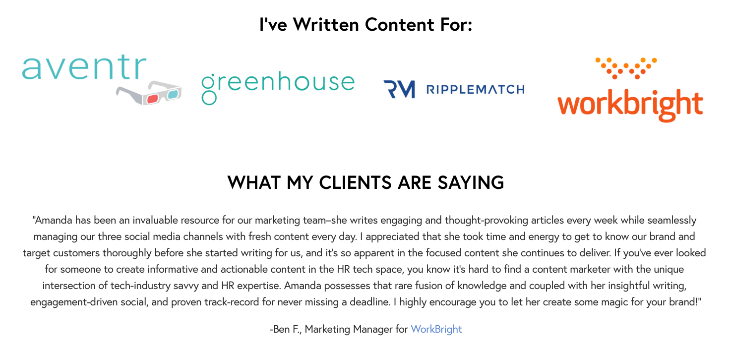
So, here’s a look at the social proof and testimonials part of my freelance website. I have logos for some of the HR tech companies I have written from. I also have a quote from one of my clients on my homepage.
This is just one way to show social proof. The way you decide to showcase your experience might be different from the way I choose to express it. Here are some other ways to showcase social proof:
Show pictures of designs you’ve worked on.
Ask for video testimonials from clients.
Add headshots to your testimonials.
Talk about numbers like social shares, email opens, etc.
Talk About Your Services
Don’t let them leave your homepage without getting to know exactly how you can help them. You don’t have to offer pricing on the homepage, although you can. I would provide a brief synopsis of some of the things you can help them with.
I would link this to your pricing or hire me page where you get more in-depth about what the services entail and how much they will cost the company who wants to work with you.
Include A Way To Contact You
Last, but not least, I think it’s essential to have a way to contact you on the homepage. I have a contact page on my site, but you never know what someone might be thinking. I don’t want to lose out on an email because I forgot to mention a way to contact me on my homepage.
I have a contact form that is linked to my freelance email address. When people enter their info on the website, I get an email right away that I can respond to when I get the chance.
You may decide to use a combination of providing your email address and showcasing a contact form. Either way will work.
Conclusion
Don’t let creating the homepage page hold you back when building your freelance website. Your homepage can look any way you want it to. I hope today’s article gave you some food for thought as you get ready to design (or redesign) your freelance homepage.


